Category
Health & Wellness
Category
Health & Wellness
Work
Rebranding Strategy, Identity, Art Direction, Experience Design
Work
Rebranding Strategy, Identity, Art Direction, Experience Design
Agency
Magy Media
Agency
Magy Media
A new identity for a Norwegian rehabilitation centre, connecting a long history of care with a more contemporary expression of strength and recovery.
A new identity for a Norwegian rehabilitation centre, connecting a long history of care with a more contemporary expression of strength and recovery.
A new identity for a Norwegian rehabilitation centre, connecting a long history of care with a more contemporary expression of strength and recovery.

Naming with Purpose
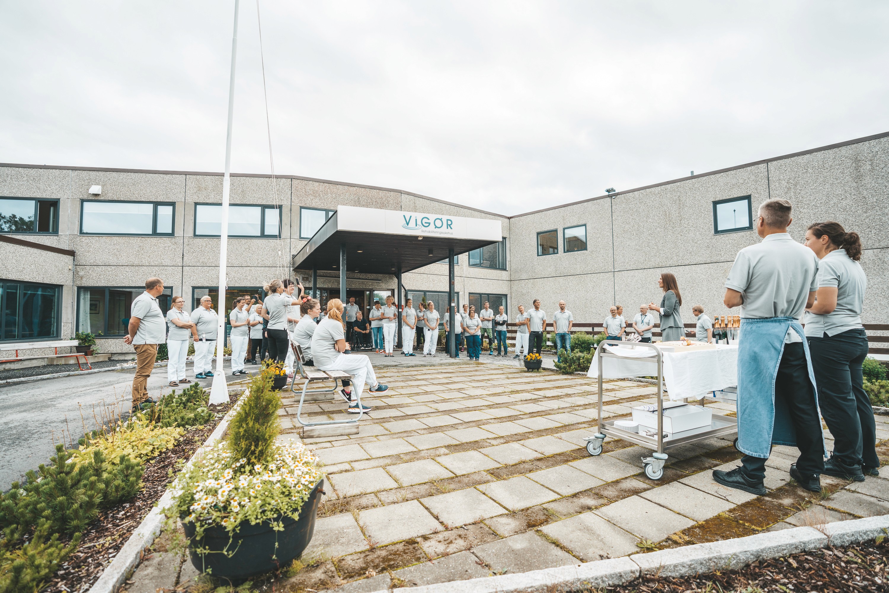
The name Vigør connects the organisation’s long history of rehabilitation with a renewed sense of strength, vitality and progress. Short, distinctive and rooted in meaning, it creates a recognisable foundation for the brand across every touchpoint.
Naming with Purpose
The name Vigør connects the organisation’s long history of rehabilitation with a renewed sense of strength, vitality and progress. Short, distinctive and rooted in meaning, it creates a recognisable foundation for the brand across every touchpoint.

Identity in Space
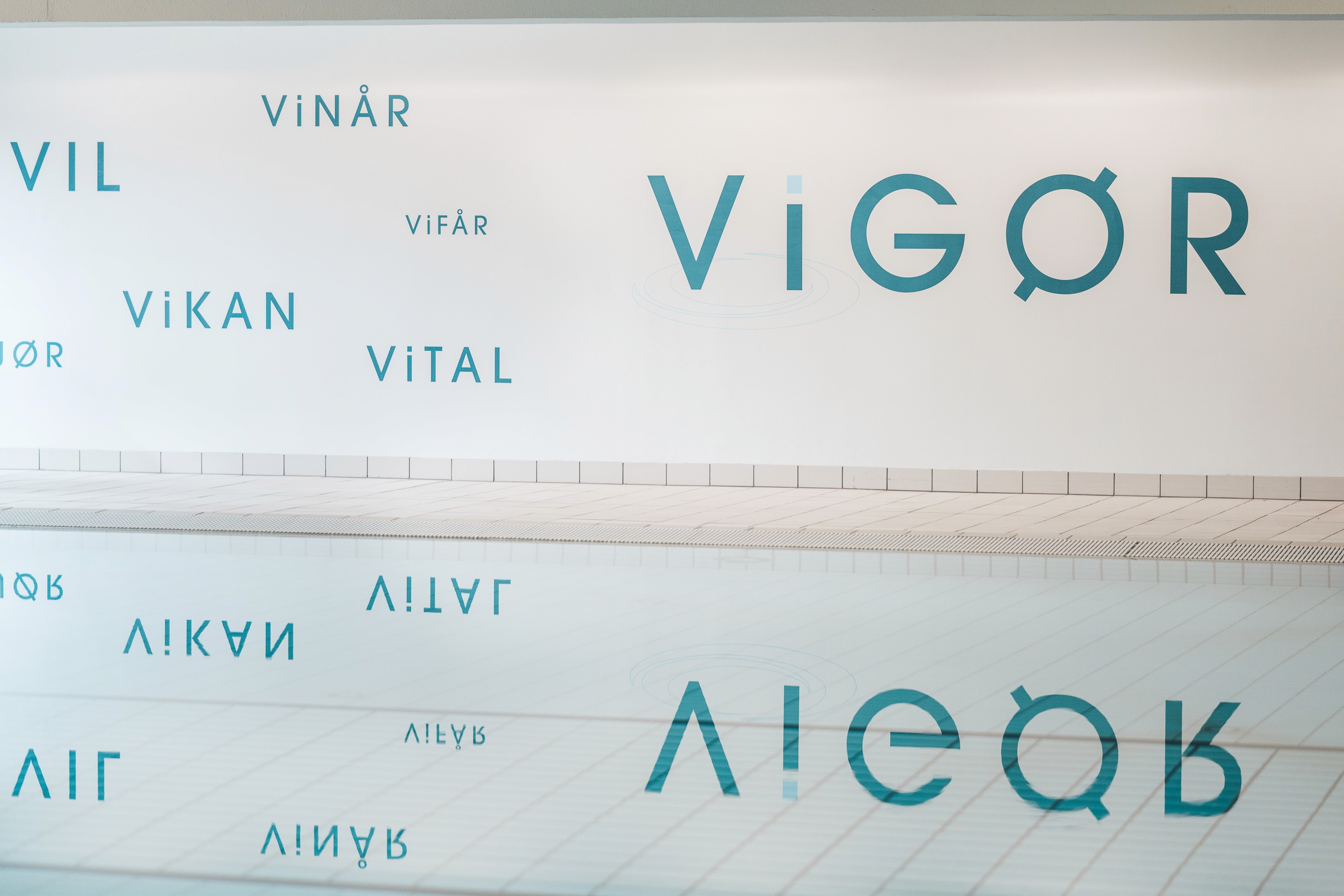
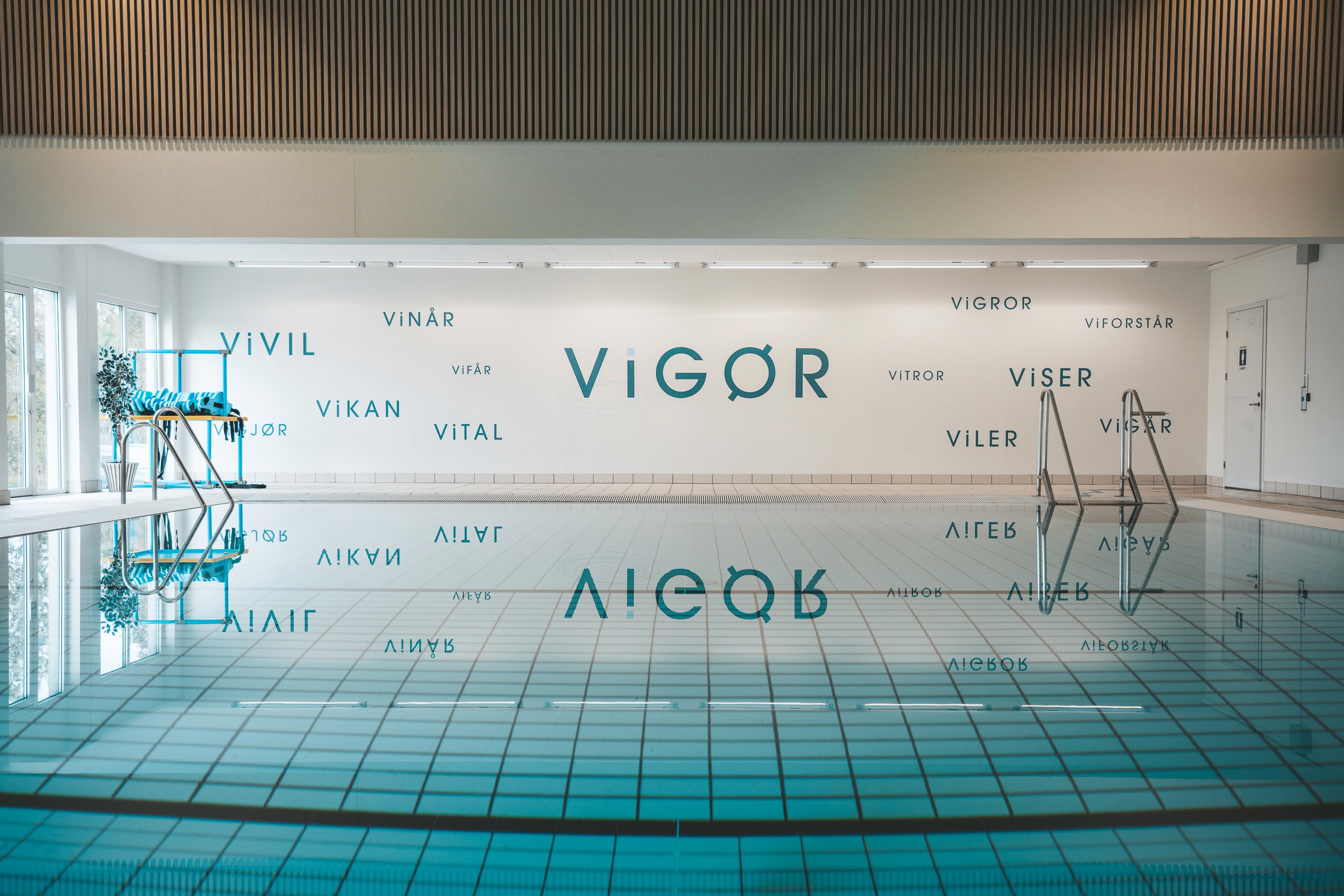
The visual identity extends beyond traditional brand applications into the physical environment. Typography, colour and environmental graphics translate the brand into a tangible experience, connecting the organisation’s spaces with its wider identity.
Identity in Space
The visual identity extends beyond traditional brand applications into the physical environment. Typography, colour and environmental graphics translate the brand into a tangible experience, connecting the organisation’s spaces with its wider identity.

A Cohesive Identity
A restrained visual language brought typography, colour and communication into a unified system. Designed to balance clinical credibility with a more human expression, the identity creates consistency without losing warmth or character.
A Cohesive Identity
A restrained visual language brought typography, colour and communication into a unified system. Designed to balance clinical credibility with a more human expression, the identity creates consistency without losing warmth or character.